Premium brands packaging copywriter for a single malt whisky tube
Click the bottle to enlarge

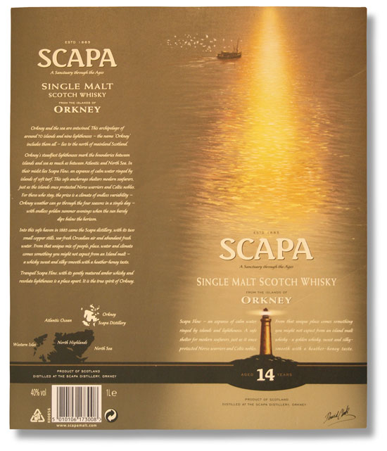
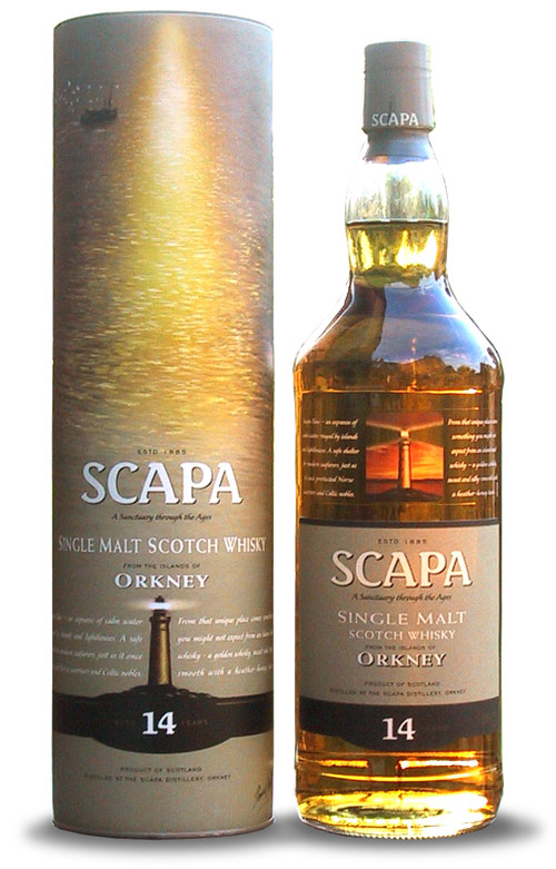
Scapa single malt Scotch whisky. A sanctuary through the ages.
Orkney and the sea are entwined. This archipelago of around 70 islands and nine lighthouses – the name ‘Orkney’ includes them all – lies to the north of mainland Scotland.
Orkney’s steadfast lighthouses mark the boundaries between peat and brine as much as those between Atlantic and North Sea. In their midst lies Scapa Flow, an expanse of calm water ringed by islands of soft turf. This safe anchorage shelters modern seafarers, just as the islands once protected Norse warriors and Celtic nobles. For those who stay, the prize is a climate of endless variability – Orkney weather can go through the four seasons in a single day – and endless golden summer evenings when the sun barely dips below the horizon.
Into this safe haven in 1885 came the Scapa distillery, with its two copper stills, sea-fresh Orcadian air and abundant spring water. From that unique mix of people, place, water and climate comes a sweet and silky-smooth whisky with a heather-honey taste.
Tranquil Scapa Flow, with its gently matured amber whisky and resolute lighthouses is the spirit of Orkney.
I’m not a whisky drinker, but I do have a soft spot for Orkney, the home of Scapa single malt Scotch whisky. So painting a picture of those islands and their lighthouses was easy. This is the kind of mood-setting story that makes you feel good about your choice of brand. It’s packaging copywriting that nudges you towards a decision in your local wine merchant, and for reading again by the fireside when the glow from the grate ignites the amber in your glass.
It seemed to work too: this brand relaunch secured a listing in Sainsbury’s, doubled sales in Germany, and lifted worldwide sales by 45%.
Legal stuff
Text Wizard® is a registered trade mark
Text and images © 2000–2020
Text Wizard Copywriting Ltd


